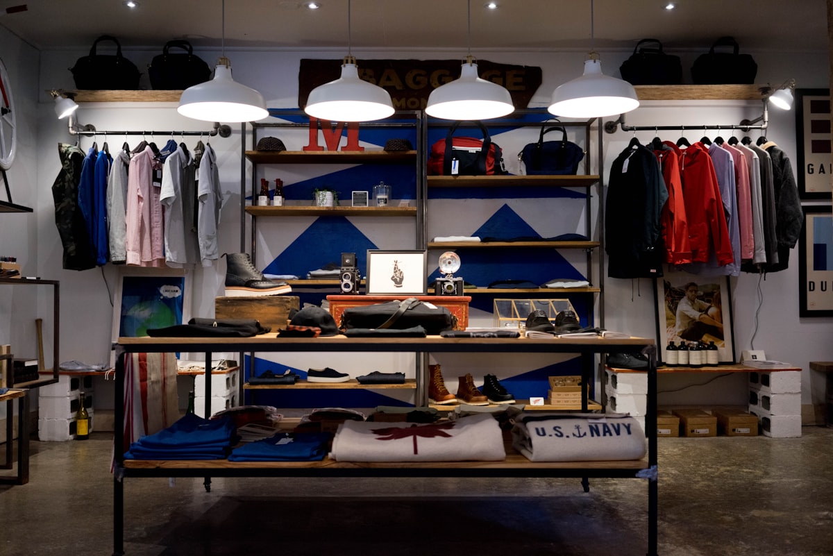

Mobile shoppers represent over 75% of global fashion ecommerce traffic. Yet, mobile screens are heavily constrained environments with high cognitive load. Placing an advanced, high-fidelity feature like AI Try-On demands meticulous visual hierarchy so it becomes an intuitive, delightfully interactive experience rather than a distracting pop-up.
The Anatomy of Mobile PDP Friction
When a user lands on a Product Detail Page (PDP), their brain works to digest multiple competing pieces of information: reviews, sizing choices, price point, shipping delays, and item descriptions. Adding a massive, blinking banner to "Try Online!" raises sensory walls and triggers ad-blocker avoidance behaviors.
The premium path is integration, not interruption. The Try-On trigger should have clear affinity with size choices and garment photos, presented as an elegant utility.
The Mobile "Thumb Zone" Rule
Modern mobile design dictates that primary interactive tools should live in the bottom half of the screen where thumbs can reach naturally without hand repositioning.
Our UX testing revealed that the most successful placements follow this layout hierarchy:
- The Secondary Utility Block: A high-contrast pill button centered directly below the active image carousel. This position signals that the try-on action directly affects the picture above.
- The Sticky Size Selector: Placing a compact "Try On" icon inline with the size criteria buttons. This allows a shopper who is unsure of fitting options to seamlessly transition into visualization.
UX Best Practices for AI Processing
These design tenets consistently yield the highest click-through and completion rates:
-
1
Visual Skeleton Loading: AI generation is complex and requires seconds of processing. Always show an elegant skeleton mockup resembling the user's silhouette to hold focus.
-
2
Explicit Privacy Labeling: Next to the upload form, include a high-contrast label clearly stating: "Photos processed instantly. Your face is never saved permanently."
-
3
Instant Image Splicing Comparisons: Let users slide between the model, their raw photo, and the AI fit output. This makes the tool feel like a playful feature rather than a strict commercial checkout gate.
"A premium interface is defined by the quality of its transitions. If a try-on button simply spawns a harsh white pop-up, the illusion of premium virtual design is instantly lost."
Result Modal Design: Direct-to-Cart Transition
Once the shopper sees themselves looking incredible in your garment, the distance to purchase is at its absolute minimum. The try-on result dialog should not just say "Superb!" and let the shopper close the widget.
The experience should present a sticky, customized action panel within the result modal displaying of-the-moment details: [Add Size M to Shopping Bag] combined with an option to download their try-on photo to share with friends. By combining visual magic with checkout simplicity, design works to elevate both merchant success and shopper satisfaction.
Ready to transform your boutique shop?
Join hundreds of forward-thinking merchants getting zero-friction fit matching.
Join the discussion
This is exactly what our Shopify store needs. The return rates are killing our margins.
Great insights on the UX side. The thumb zone tip is gold.